Zara App Redesign — A Case Study
For this project, we sought to address the inadequacies of Zara’s mobile application. The idea came from the fact that Zara’s web browser has had a long history of difficulties in navigating their site. Their mobile app is no different. Zara is a popular clothing store for college-aged students. Zara is famous for having eccentric photos on their websites. This makes online shopping difficult because when customers are looking for a product to buy, customers are unable to get a good gauge of the actual product. The general format of the website and mobile app content is also very difficult to navigate. All these reasons made Zara a good company to investigate for an app redesign.
The team consisted of 3 UX Designers.
Tools
Figma, Mural, Google Surveys
My Role
UX Designer
Year
2023
Step 1: Cultural Probes
We wanted to create two cultural probes to gain insight on their thoughts on the Zara app's interface. The first probe was a Google Survey to be filled out at the end of using the app and the second probe was an audio recording of the participants while they were using the app. The intention behind doing these two probes in tandem was to hear their live thoughts as well as their opinions about the app in a qualitative way.
We recruited 3 undergraduate students at UW-Madison to be our target user base. The students fit the mold of being college-aged, and they were all people who’ve shopped at Zara in person, but never online, so they got their first look at the mobile application during our cultural probes which made their reactions and insights authentic.
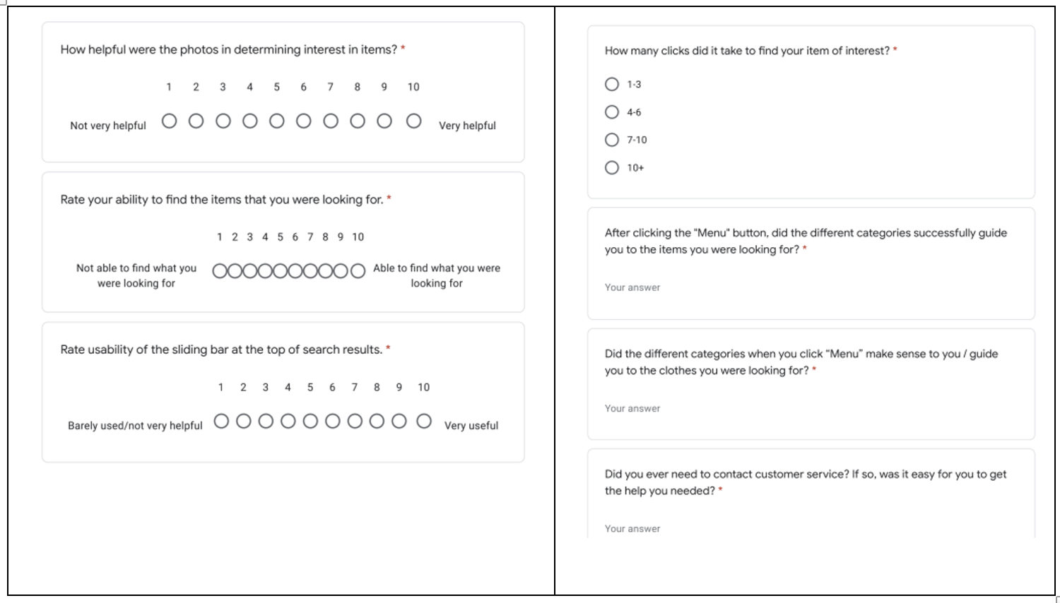
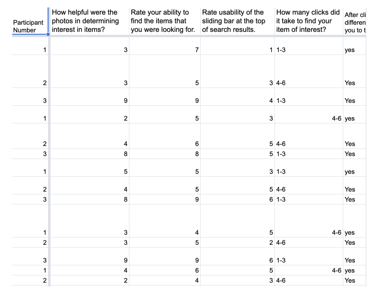
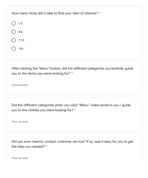
You can scroll through examples of our Google Survey questions below as well as a chart of our findings below!

Step 2: Ideation
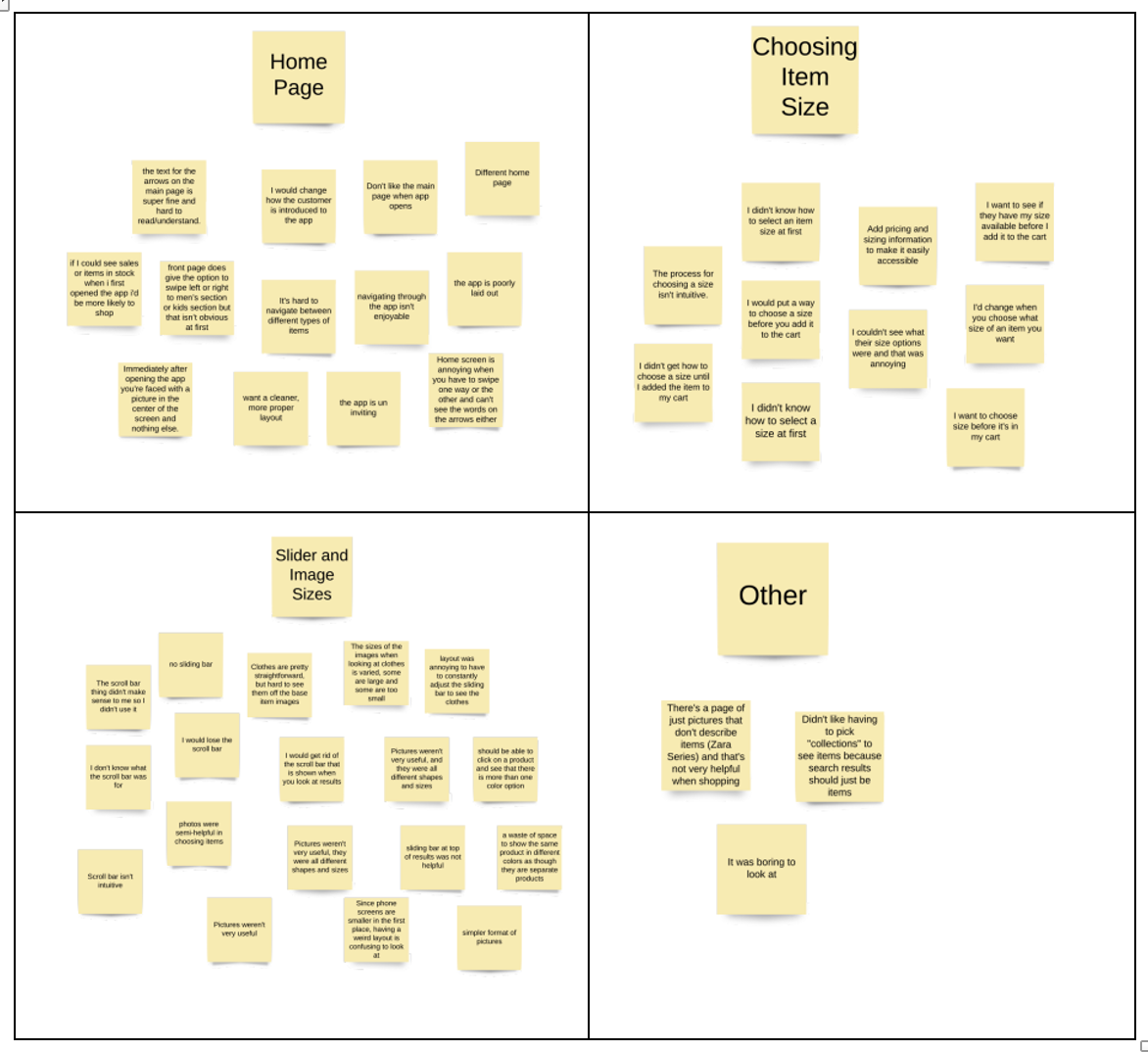
After collecting the data from the cultural probes, we wanted to group the pain points into specific areas of the app. From this, we identified the areas where users were having the worst user experience.
Home page — homepage caused a lot of confusion for our users because they often had to click on multiple linked buttons before finding the option they were looking for
Results of the search — while viewing the results of a search or selection, the images of the items were all different sizes and that made scrolling through the items difficult
Although there was a scroll bar available at the top of the page to make all the image sizes uniform, many of our users were unaware of this
Selecting sizes — wasn’t always clear how to select the size of a clothing item that they were interested in if they were looking for availability or were trying to add an item to the cart
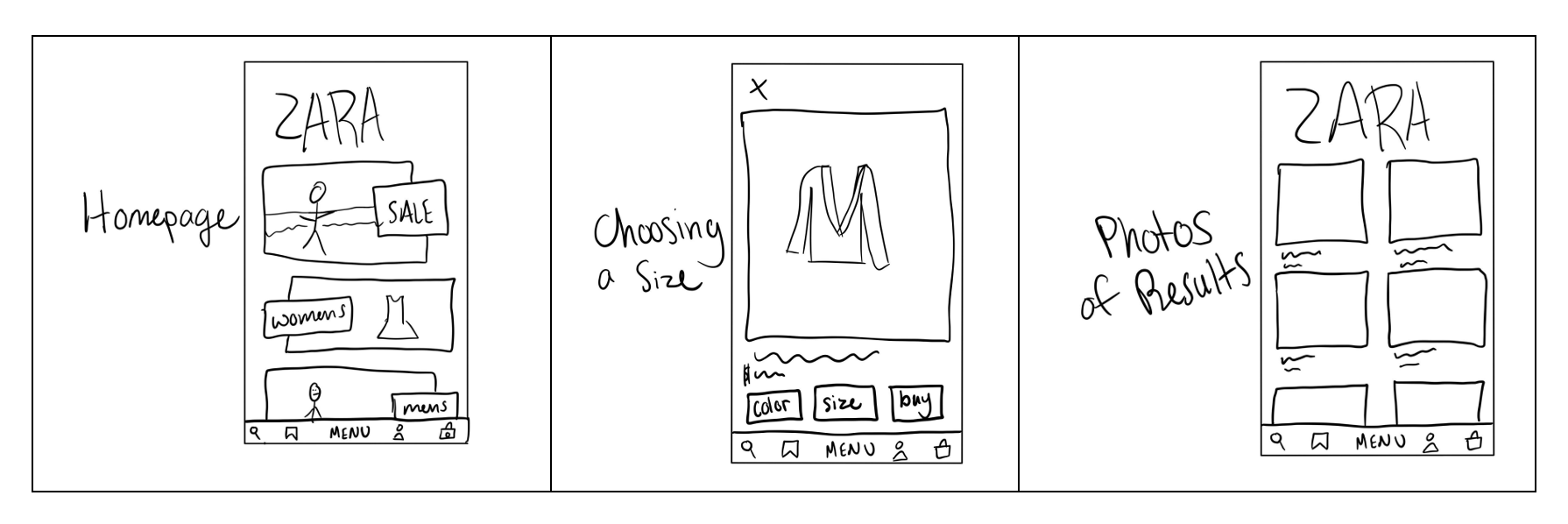
Step 3: Low Fidelity Prototypes
After analyzing the participants’ thoughts from the organized models, we were able to create some sketches of lo-fi prototypes for the homepage and image results pages.
Homepage — we focused on making all the menu options available right away so that the user doesn’t have to click through multiple times to look for the clothing type they’d want
Results of search — we decided to create standard-size boxes with descriptions of the items in linear order on the results page for user convenience and to clean up the layout
Selecting sizes — we had size selection as larger buttons so users would be less likely to be confused on how to select a size
Step 4: Evaluation of Low Fidelity Prototype
To evaluate the effectiveness of the low fi prototype, we decided to do a Cognitive Walkthrough. In our Cognitive Walkthrough, we asked ourselves to find an item of clothing of interest and add it to our shopping bag on the Zara mobile app. Every step we took, we asked ourselves these four questions:
Will the users try to achieve the right effect?
Will the users notice that the correct action is available?
Will the user associate the correct action with the effect trying to be achieved?
If the correct answer is performed, will the user see that progress is being made towards the solution of the task?
From this, we learned that our changes to the mobile application met many of the challenges that we sought to address. However, there were some elements that still needed work. For example, although the answers to the four questions above often were answered in a yes, we sometimes fumbled around with the prototype more often than was expected. One of these instances we noticed was that the participants didn’t seem to like that the “Sale” page from the original prototype was the first option they saw. Because of this, we changed the layout to have the options “Womens”, “Mens” and “Kids” before the “Sale” option (which is now not visible) in our final prototype.
Step 5: Final High Fidelity Mockups
In our design, we tackled three main points that we sought to fix: the ambiguity of the homepage, the waste of space of the photo results and the unclear way of choosing sizes and adding to the bag after clicking on an item. To do this, we changed the homepage to include categories such as “Women”, “Men”and “Kids”. Next, on the results page, we made it so all the photos of items were uniform as to not waste space. Lastly, we displayed sizing, color and other options prominently under the photos of clothing once clicking on the item from the results page.
We designed three screens to address our three problem areas discussed above. In the first page, we have the homepage where you can click on “Womens”, “Mens” and “Kids” options to guide you to the next page. In the screenshots below, you can see the homepage (on the far-left) and the nextpage (in the middle) that it will bring you to. In our Figma prototype, we only have it designed for the buttons on the homepage to lead you to the women’s clothing section to give an overall idea of how things will work.
From the women’s clothing section screen, you can click on one of the clothing items, which will lead you to more information on the clothing item (i.e., clothing size options, add to bag). This is exemplified in the screenshot and recording below.

Final Thoughts & Challenges
We thought of this project because of our personal frustrations with the Zara app. During this time, Zara was one of our favorite stores to shop at and we grew increasingly frustrated with the user experience and user interface of the app. It was really fun to take this idea and perform a case study on it.
For this project, user research was our focus. It was a lot of fun creating the cultural probes, gathering the data and interpreting the data. I think, however, some of the findings from the cultural probes could've been found with just one cultural probe. For projects where there might be more of a time restriction, I want to keep this in mind in the future. I also wish that I would’ve taken screenshots or a screen recording of the Zara app at the time we did this case study. It would’ve been useful from a case study standpoint for those reading our case study to understand the user pain points better and how our design addressed those pain points.